Biblos Foundation UX/UI


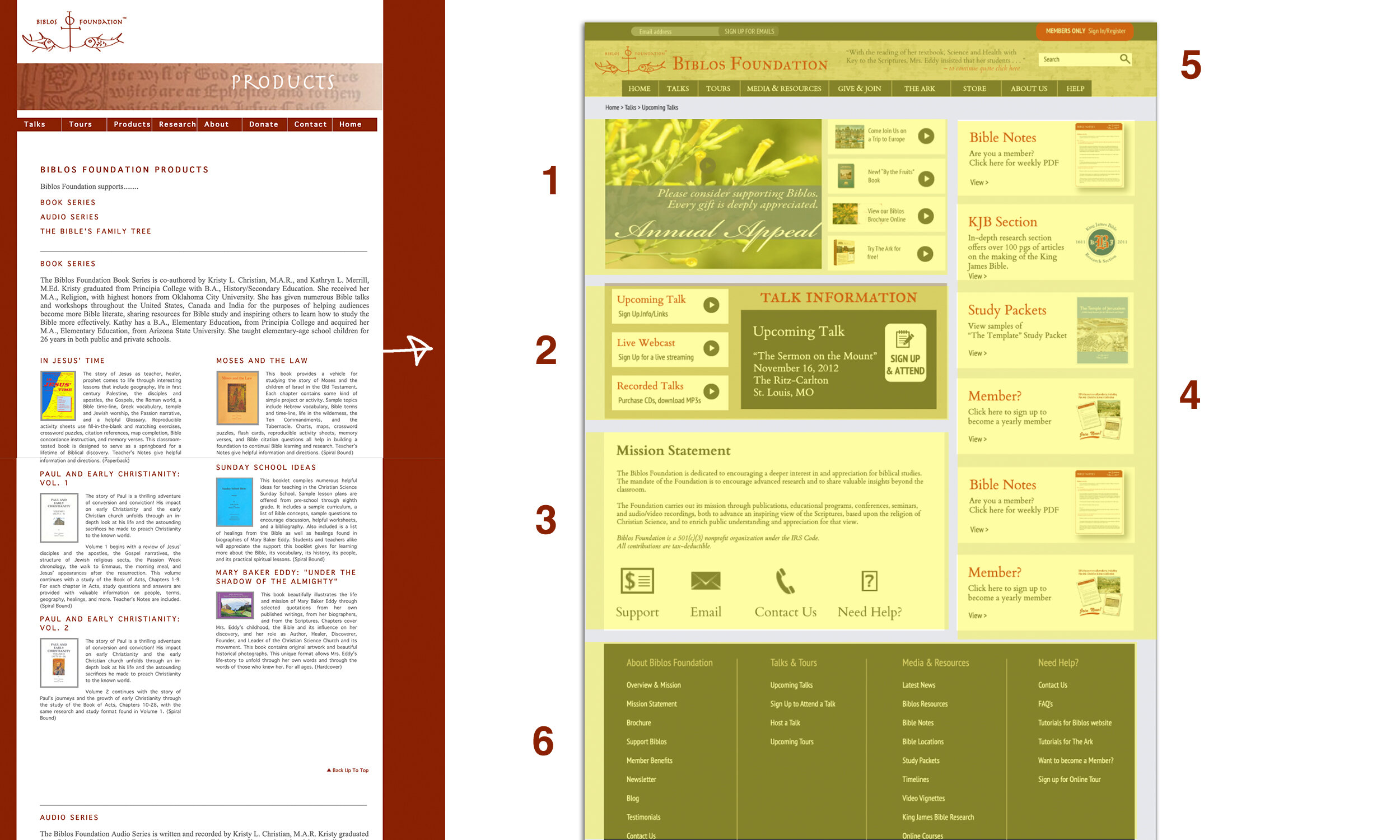
The older version of the website was HTML (created by me) back in 2009-2010 using Dreamweaver. I designed this new prototype based on the client’s preferences to do a massive overall of the old website and implement the newest technologies of the time - mainly a membership platform and new CRM for the admin side.
There was so much information though that my client wanted so in one brainstorming session I took a yellow note pad to sketch out feedback on what is the most important areas that the user should see first, second, third, etc, and helped my client understand creating a hierarchy of information. I also kept in mind that my client needed the homepage to be constantly updated with new information so by instant, I created “boxes” or “areas” to upload information into.
The main content area was a timed moving slideshow with 4 possible slides to showcase the latest information.
The second was the my client’s Talk Schedule that was also based on real time information and needed to be easy for her clientele to locate & easy to sign up.
This area was contact information (below the fold) that needed a permanent place for easy access.
The entire right side with “banners” were also areas that needed to be updated but they were essentially content-based - esp for members, or to highlight a book or audio tape on sale in the store.
The menu/navigational bar was definitely a challenge. My client wanted so much packed in there so we designed areas within this space according to standard practices. The best feature was the red “member login” button is so common practice today (2020) but almost “new” to 2012.
Finally, the bottom footer with all the links available was also a new concept that was copied from other websites. Almost “magazine-style” helpful because we had so much content for folks, as a mini site map another option instead of looking through the drop-down menus above.

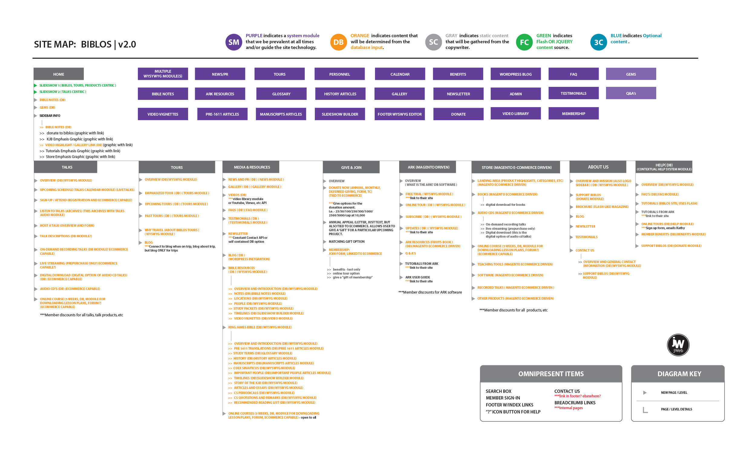
I worked directly with the Software Development team (outsourced) to understand the very big needs of my client. She wanted to implement a new member website portal (which is was a lot of work in 2011-2012). We had a brand new admin CRM built to help administer a huge volume of content with pages, images and videos for membership. She also wanted a full functioning store with member pricing. The development team used Magento.

My client wanted a great deal of content available to her members. All of her talks (both audio and video versions), an entire photo gallery of locations of the Bible, weekly Bible Notes, Entire 30+ page handouts highlighting specific Biblical topics like “The Temple,” “Herod the Great,” and “Jerusalem. I also worked on almost a dozen “Video Vignettes,” uploaded video clips and over 40+ Bible Location pages, Timelines and an entire separate “mini-website” dedicated to the History of the King James Bible.

The Talk section included all my client’s sign-ups (and online payment system) for her live talks throughout the year, as well as past talks available to purchase as audio. On-Demand could be my client’s talks with her visual PowerPoint Presentation along with it and finally, we helped my client launch her first online eCourses.

Alongside all the immense content that my client wanted available online through different platforms, another part of her nonprofit was to lead Bible Tours throughout the year. The tours section needed all of her tour information and also a way for people to sign up and make deposits or link to the Travel Agency website etc. Itineraries were launched here with 2-3 trips per year.
My team also helped my client launch a live blog during each trip for everyone to follow along. All of these blogs were kept archived in this section.

Initial Style Sheet for Software Development Team 2012.